Conversational Finance charts
hila provides a set of charts that help you visualize your data in the Conversational Finance application.
- Bar chart
- Combo chart (bar and line)
- Horizontal stacked bar chart
Bar chart
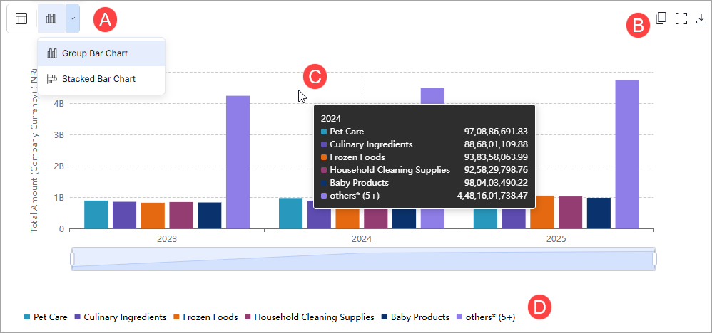
Bar charts are the standard charts in hila. Bar charts shows data in rectangular bars with lengths proportional to the values they represent.
-
The controls for the chart are:
-
Copy chart.
-
Hover over a bar to see the value.
-
Select an item in the legend to toggle the visibility. This is particularly helpful if the answers are difficult to see because they have different scales or different units.
-
Combo chart (bar and line)
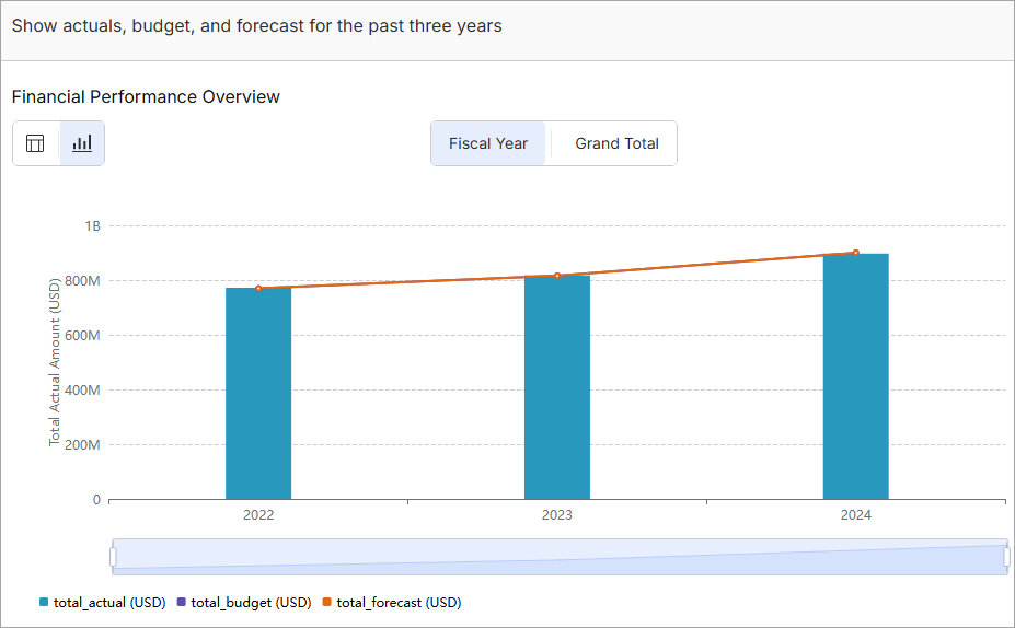
A combination of line and bar charts that helps to visualize actuals, budget, and forecast across a period of time.
Example questions:
- Show actuals, budget, and forecast for the past three years.
- Show actuals and budget for each quarter of FY24.
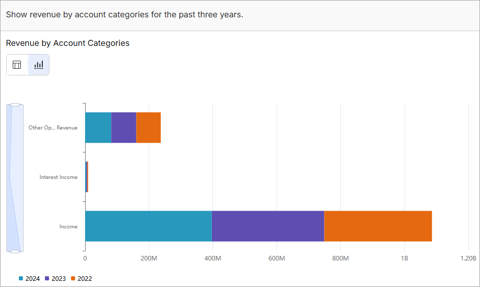
Horizontal stacked bar chart
Shows revenue or expense data broken down by specific dimensions. This chart provides a clear breakdown of financial data, highlighting the largest contributors while grouping smaller segments for simplicity.
Example questions:
- Show revenue by account categories for the past three years.
- Show quarterly sales for all products in product group Baby Care PG0001 for FY24.
- Show revenue shares of each product in Product Group PG0001 for each year from 2022 to 2024.